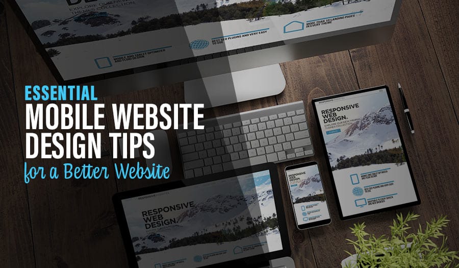
Nowadays, a website that is mobile friendly is no longer optional. More internet users now access the web from their mobile devices than from desktop computers, making a digital presence that is easily accessible and user-friendly regardless of device absolutely paramount.
10 Tips for Effective Mobile Website Design
- Embrace Responsiveness
- Adjust Your Navigation
- Keep Your Content Succinct
- Enhance Visuals
- Make it Fast
- Avoid Flash
- Link Your Contact Info
- Integrate Mobile Capabilities
- Optimise Your Forms
- Test Extensively
Marketers and brands who don’t embrace mobile technologies threaten to be left behind in their competitive environment. Audiences on their smart phones and tables who have the choice between reading a mobile-friendly and a static website will always choose the former.
To make sure that your brand remains relevant and effectively reaches your audience online, here are 10 tips for effective mobile website design.
1. Embrace Responsiveness
All mobile website design should start with a responsive framework. You don’t know the device on which your audience sees your digital presence, and responsive design adjusts dynamically to optimise the experience regardless of screen size. Google specifically advocates for responsive design as the preferred mobile-friendly alternative for your website.
2. Adjust Your Navigation
Mobile users will interact very differently with your website than their desktop counterparts. They use their fingers rather than a mouse to navigate, and your navigation should accommodate this difference. Nielsen’s guide on mobile navigation is a great starting point to design a framework that works for mobile users.
3. Keep Your Content Succinct
Avoid dreaded ‘walls of text,’ which occur because of long paragraphs that don’t translate well to small screen sizes, at all costs. Instead, keep your sentences and paragraphs short, and break them up with bullet lists and white space for better user experience.
4. Enhance Visuals
Visuals matter in all types of content marketing, but their importance increases exponentially for mobile visitors. You can communicate better-using images, graphics and videos that are optimised for and accessible with mobile devices. They also help to keep your content short, a crucial advantage as mentioned above.
5. Make it Fast
Mobile users are less patient while waiting for your site to load than desktop users. To avoid negative disruption, keep your loading times low by minimising your code and optimising all images for mobile devices.
6. Avoid Flash
Flash is on its way out as a tool to make your website more interactive because it doesn’t work on many mobile devices. A flash-based website will not display right, so use HTML5 instead when looking to enhance your website beyond static text and images.
7. Link Your Contact Info
Mobile devices offer the convenient opportunity to directly link your contact information to an action on your visitors’ phone. For example, you can link your phone number to be callable with a single click. Taking advantage of this opportunity increases your chances of visitor interaction and communication.
8. Integrate Mobile Capabilities
Of course, you can also link your website with other phone and tablet capabilities and apps. For example, you can take advantage of geolocation services, offering specific content only for users whose phones communicate that they are in a specific geographic area. Alternatively, if your business has a physical location, integrate your website with Google maps to offer dynamic and interactive directions.
9. Optimise Your Forms
Mobile users will not be willing to fill out sign up and contact forms as much their desktop counterparts, simply because it takes more time. To accommodate them, minimise the amount of text input on your phones by offering drop down and radio button options where ever possible. Of course, as is the case for all conversion-optimised contact forms, the less fields your users have to fill out, the better.
10. Test Extensively
Finally, don’t assume that the above tips will get you to a flawless user experience. To truly optimise your mobile website design, you should be sure to test that your visitors actually enjoy your site and take the actions you want them to take in order to turn into customers. Navigation and usability testing should take up a major part of your mobile web design update project.
All of the above tips can lead to a complex process needed to ensure that mobile users enjoy your website as much as their desktop counterparts.
If you need help in that regard, you may want to consider getting in touch with a web design firm that knows how to create digital presences optimised for mobile audiences.
Read More
5 Characteristics for Effective Web Design for Inbound Marketing
What Is An Email Workflow And How Can I Use Them Effectively?
7 Tips to Optimise Your E-Commerce Product Pages
Campaign Monitor vs MailChimp: Which is best for your business?
5 Things You Should Know About Digital Marketing Automation


